There are numbers coming at us from every corner of the planet. How do we distill them down to understand the underlying trends?
In particular, how do we quickly answer the question "What is the current trend of COVID-19 in a location of interest?"

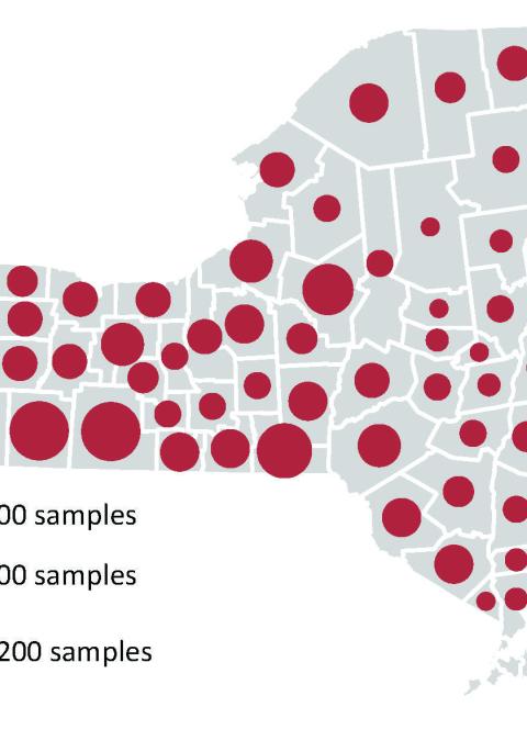
One way to answer this question is to conduct a quick "back of the napkin" calculation to determine the location-specific growth rate of confirmed cases. The quick calculation uses a single type of data: the number of confirmed cases that are periodically reported in that area. The nice part is that this data is often publicly available on the websites of state health departments, federal agencies, or international organizations.
Here is the equation used in the calculation:
Daily growth rate (in the area of interest) = # of open cases today (in that area of interest) divided by the # of open cases yesterday (in the same area of interest), as measured at the same time per day.

To make the figure, we saw that the US reported B open cases of COVID-19 at 4 p.m. ET on one day, and A open cases of COVID-19 at 4 p.m. ET, the next day. Using that time series data of case counts, the one-day growth rate in open cases of COVID-19 for the US during that 24-hour period was:
A/B
We repeated the calculation each day at 4 p.m., and then plotted each day's growth rates (y axis) against its corresponding date (x axis).
How do we interpret this one-day growth rate in confirmed COVID-19 cases for the US?
1) If A>B, the growth rate is above one, which is equivalent to saying: (a) the total number of confirmed cases are growing, (b) cases are being opened faster than being closed, (c) there are more confirmed cases at the end of the 24-hour period than there were at the beginning of the same period (d), things are going to get worse before they get better, (e) beds in hospitals are more likely to be filled by COVID-19 patients than vacated by COVID-19 patients, (f) the overall situation is going "up" the curve".
2) If A=B, the growth rate is equal to one, which is equivalent to saying: (a) the number of cases opened and closed during that 24-hr period are equal, (b) the overall situation is near the "top" of the curve".
3) If A<B, the growth rate is below one, which is equivalent to saying: (a) the number of open cases are declining, (b) pre-existing cases are being closed faster than new ones are opened (c) there were more confirmed cases at the beginning of the 24-hour period than at the end of the same period, (c) things are improving, (d) beds in hospitals are more likely to be vacated from COVID-19 patients than filled by COVID-19 patients, (e) the overall situation is going "down" the curve".
Here is another way to think about a daily growth rate:
A daily growth rate of 1.1 means that there is a 10% NET increase in open cases in that area per day.
A daily growth rate of 1.4 means that there is a 40% NET increase in open cases in that area per day.
A daily growth rate of 2.0 means there is a 100% NET increase in open cases per day. Incidentally, this is equivalent to a one day "doubling time".
A daily growth rate of 1.0 means that there is no NET change in open cases per day. Note that when the growth rate is one, new cases can appear, and old cases can be closed, the two types just have to balance each other.
A daily growth rate of 0.90 means that there is a 10% NET decline in open cases per day.
A daily growth rate of 0.56 means there is a 44% NET decline in open cases per day.
See the pattern? One is a big deal!
In fact, the mathematical threshold located at one can also be used to understand the concept of "flattening the curve". To flatten the curve is to take actions that reduce the growth rate of confirmed cases from some number greater than one to some reduced number closer to one, equal to one, or better yet, less than one.
Lets think about the concept of flattening the curve in the context the US from the figure above. We used publicly available data and many iterations of our quick growth rate calculation to reveal our collective trend of COVID-19 cases in the US. Our graph suggests that in the US, case counts are still climbing, but we have collectively taken actions over the past month that have functioned to drive our growth rate down. This data suggests that we are succeeding in flattening the curve!
But be careful; the daily growth rate is "noisy", meaning that there can exist small dips on certain days (while the overall weekly trend is still going up), or small increases on certain days (while the overall weekly trend is going down). It is good to remember the nature of the data that we are using, and that there is a HUGE amount of stuff going on "behind the scenes" to even measure and report a single confirmed case! In fact, case data simultaneously summarizes innumerable epidemiological, demographic, economic, geographical, and societal processes that are operating in tandem, none of which are explicitly examined in this calculation. Although such processes are crucial in the scientific modeling of COVID-19, and their incorporation is the craft of modelers, those considerations are beyond the scope of this demonstration.
One quick approach for distilling broad trends out of noisy data is to calculate the daily growth rate for every day in a whole week. This will let you: (a) ascertain each day's rate of growth, and (b) see that data point in the broader context of its temporal trend. We took this exact approach to produce the figure above.
Another approach for distilling broad trends out of noisy data is to broaden your time unit. For instance, you could calculate the two-day growth rate:
Two-day growth rate (in some area) = # of cases today (in that area) divided by the # of cases two days ago (in that same area).
Similarly, you could calculate a five-day growth rate:
Five-day growth rate (in some area) = # of cases today (in that area) divided by the # of cases five days ago (in that same area).
Perhaps you have noticed that growth rates are dimension less, meaning the same mathematical calculation can be adapted to any geographical scale (e.g. Tompkins County, the entire state of New York, the entire US, or the entire globe) or adapted to any temporal scale (e.g. one minute, one hour, one day, three-days, week, one year). Even better, the mathematical threshold of one remains the same regardless of the units that you use in your calculation. Your interpretation must be put into context of your selected units, but otherwise the interpretation of your growth rate remains the same.
So go ahead, track down some publicly available data, and conduct your own calculations to broadly understand the COVID-19 trend in your area!
One final (and important) note. The mathematical models used by scientists to track COVID-19 contain a huge number of variables and technical components that are not included in this demonstration. This demonstration is merely one of many possible "back of the napkin" calculations that can help you sort through the mountain of data flying at each of us from every direction. "Back of the napkin" calculations should never replace the careful scientific modeling and situational evaluations made by disease experts, nor do we imply that they should.